The Good, the Bad, and the Ugly: Pt. 1
This post begins a three-part series of reviews concerning three very different websites focused on popular music.
The Ugly: Prog Archives 🔗
URL: http://www.progarchives.com/
PROG ARCHIVES launched on September 1, 2002 as a collaborative project born from “a common dream of a small group of fanatic progressive rock music collectors who decided to develop a WEB SITE for the online progressive rock music community.”1 For the uninitiated, “progressive rock” originally served as a blanket term that attempted to group an eclectic group of very different bands formed in the United Kingdom, the United States, and western Europe in the late 1960s and early 1970s under the same umbrella. While the musical qualities of these bands varied dramatically, some of progressive rock’s common characteristics included unusual and/or rapidly changing time signatures (4/4 time is the exception rather than the rule); multiple movements with recurring motifs within lengthy, frequently complex song structures (often exceeding 7-8 minutes in length); non-traditional rock instrumentation and timbres (e.g., rock flute, organ, cello, gamelan, theremin, etc.); emphasis on virtuosic, extended soloing or, in some cases, ensemble jamming; and psychedelic and/or non-traditional lyrical themes (suffice it to say that “teenage love” was not the norm). Some early progressive rock bands, many of whom still exist and tour today, include Genesis, Gentle Giant, Jethro Tull, Kansas, King Crimson, Magma, Mahavishnu Orchestra, Pink Floyd, Procul Harum, and Yes. Since the early era of progressive rock (ca. 1969 - 1976), the term has expanded its breadth to include contemporary artists from across the globe whose debut albums released decades later.
Prog Archives appears to be the only site of its magnitude devoted exclusively to progressive rock, broadly understood. (The site covers a great number of subgenres, including the Canterbury scene, Indo-Prog/Raga Rock, Jazz Rock/Fusion, Krautrock, Post Rock/Math Rock, Progressive Electronic, Progressive Folk, Progressive Metal, Psychedelic/Space Rock, Zeuhl, et al.) Among the site’s chief functions are
- Maintenance of comprehensive discographies (with album reviews) and brief biographies of each artist included in the site’s database
- Fostering and maintenance of a global online community (via forums) that discusses progressive rock topics and collectively reviews and approves artists and albums to be included in the site’s database
Articles devoted to particular bands and their discography feature digital album artwork, release histories and variations across audio media, links to audio streaming and music sale sites that carry that artist’s works, album reviews, and upcoming tour dates.
In the interests of full disclosure and putting the final nail in my geek coffin, I should divulge that I love Prog Archives for the sheer amount of obscure information about equally obscure artists that it collects and preserves in one virtual location. Without this site, I never would have learned nearly as much as a I have about these eclectic artists and their music. My discovery of the site was a truly eye-(not to mention ear-)opening experience, and I can credit Prog Archives with deepening and broadening my musical interests.
But—man, oh, man!—is the site hideous! Just...plain...ugly...
I hardly know where to begin critiquing this website from a design perspective, so let’s simply take it from the top:
- The site header is a static JPEG whose color scheme is all over the map.
- The Prog Archives logo, itself, uses a font with limited legibility for some readers.
- The stationary navigation bar—if one can call it a navigation bar—at the top of the screen greets visitors with a barely organized mass of hyperlinks.
- The length of the opening page is a mile long, displaying the most recent 10 album reviews, whereas it should probably only display the most recent 5 or fewer, in my opinion. (This problematic length is compounded by the fact that only remotely handy navigation options disappear off the top of the screen by the time the reader scrolls down to the first album review.)
- The body text is too small, and numerous parts of the site fail to achieve an acceptable contrast ratio between background color and font color.
- There are no—count ’em: zero—attempts to render the site responsively across devices. The site administrators could not even be bothered to add the
<meta name="viewport"
          content="width=device-width, ...">
tag to the document head, BUT, naturally, they did take the time to add SEO-optimization meta tags to make sure the difficult-to-browse site fares well in Google search results. - Under the hood, there appears to be little effort devoted to serving up a secure website. For instance, the year is 2022, and Prog Archives is built on insecure jQuery and offers no option to connect via HTTPS. Good luck with that!
- To its credit, Prog Archives does make an attempt at incorporating modern accessibility attributes into its HTML; however, one of the most basic elements of HTML, namely, the <title> tag, is missing from many of the site’s child pages.
I almost (almost) wish I could show you the site in one of its slightly different incarnations: specifically, the look of the site when its administrators decided, for a time, to start selling advertising space:

You get the picture, and it isn’t a pretty one: if the aim of Prog Archives was to approximate the garish, larger-than-life, theatre costume-inspired rock music fashions of the late 1960s and 1970s as a website, it succeeded in spades. Let’s move on from moaning to metrics.
WebSpeed Insights Analysis:
Test Conditions:
OS: Android 12
Cellular Network: Boost Mobile 5G
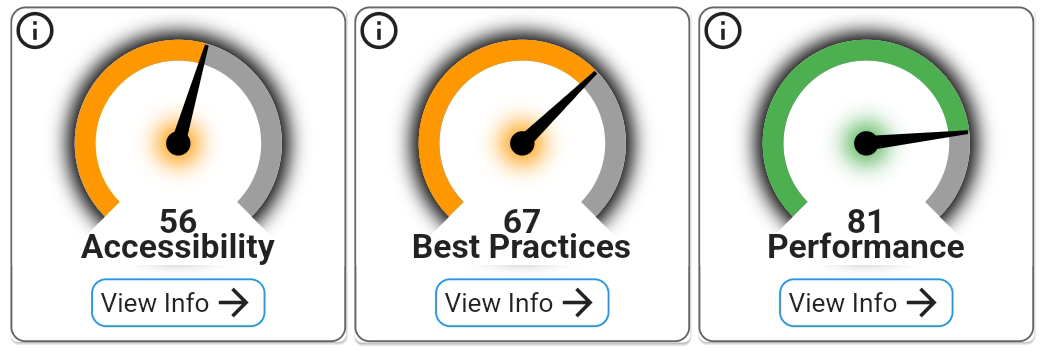

The only huge surprise in these results is that Prog Archives did not receive lower scores than it did; however, I will point out that, when the site does venture into the green score range (80-100), it just barely makes the cut (and that is on performance, alone).
Prog Archives’ desktop and mobile browser experiences did not receive very high marks for accessibility or best practices. In addition to the problems I identified above, the WebSpeed Insights rubrics that the site failed to meet are:
- `<frame>` or `<iframe>` elements do not have a title
- Image elements do not have `[alt]` attributes
- Form elements do not have associated labels
- Links do not have a discernable name
- Lists do not contain only `<li>` elements and script supporting elements(`<script>` and `<template>`
- Page lacks the HTML doctype, thus triggering quirks-mode (a built-in modality for modern browsers web attempting to maintain backward compatibility with older web pages)
- Browser errors were logged to the console
- Serves images with low resolution
The fact that many of these issues would be simple to resolve suggests to me that Prog Archives suffers from inertia and neglect at the site administrator level.
lambdatest.com Results (a sample)
Google Chrome


-768x1024.png)
Mozilla Firefox




-firefox-768x1024.png)
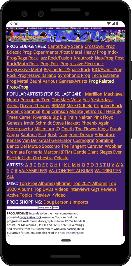
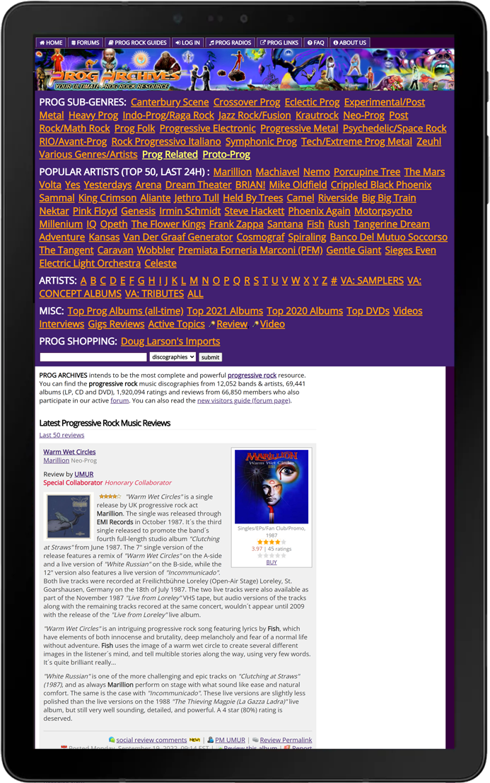
lambdatest.com did not detect any new issues that I have not mentioned above. I will point out that it seems Mozilla Firefox on mobile devices did not seem willing to scale the site to fit the handheld device screen at all, whereas Google Chrome seems to have forced the site to scale to fit the smaller device screen. I find it difficult to say which one looks worse, though I suspect mobile Firefox users will be doing a lot of re-scaling and scrolling to be able to target specific links with their fingertips.
The Bottom Line:
Prog Archives represents a monumental effort to document some significantly unpopular music that, otherwise, might be lost to succeeding generations. I commend the site for its accomplishments in that regard. On the other hand, just because Prog Archives chooses to catalogue tons of old music does not mean the site needs to show every wrinkle in its twenty-year-old face. It is fair to say that the site could use a major facelift in terms of accessibility, navigation, responsiveness, and security, though I am not clear on what back-end impediments might exist to make such improvements prohibitive at this time. Accordingly, if any persons reading this wish to visit Prog Archives, especially on a mobile device, they may want to do so for the information (which I highly recommend), but they may want view it with one eye closed.